My response to one of this years student briefs set by the International Society of Typographic Designers. With nearly 100 years as the authority for Typography in the UK, and more so internationally every day, the ISTD reflects the current state of contemporary work.
In my opinion their current brand fails to represent the ISTD for what it is - an immense source of inspiration to students, educators and international practitioners alike.
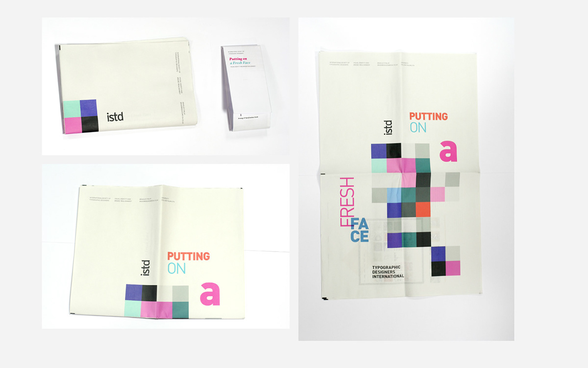
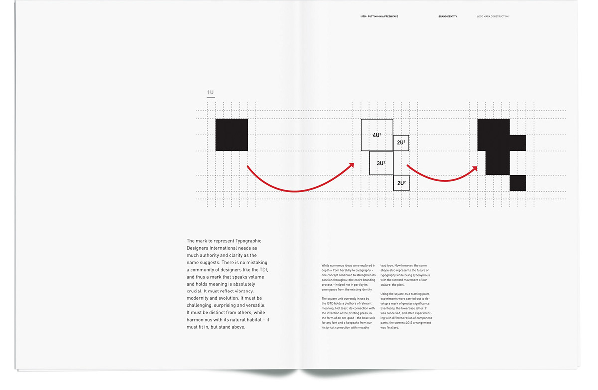
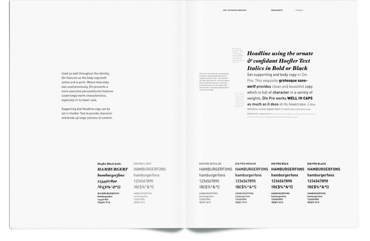
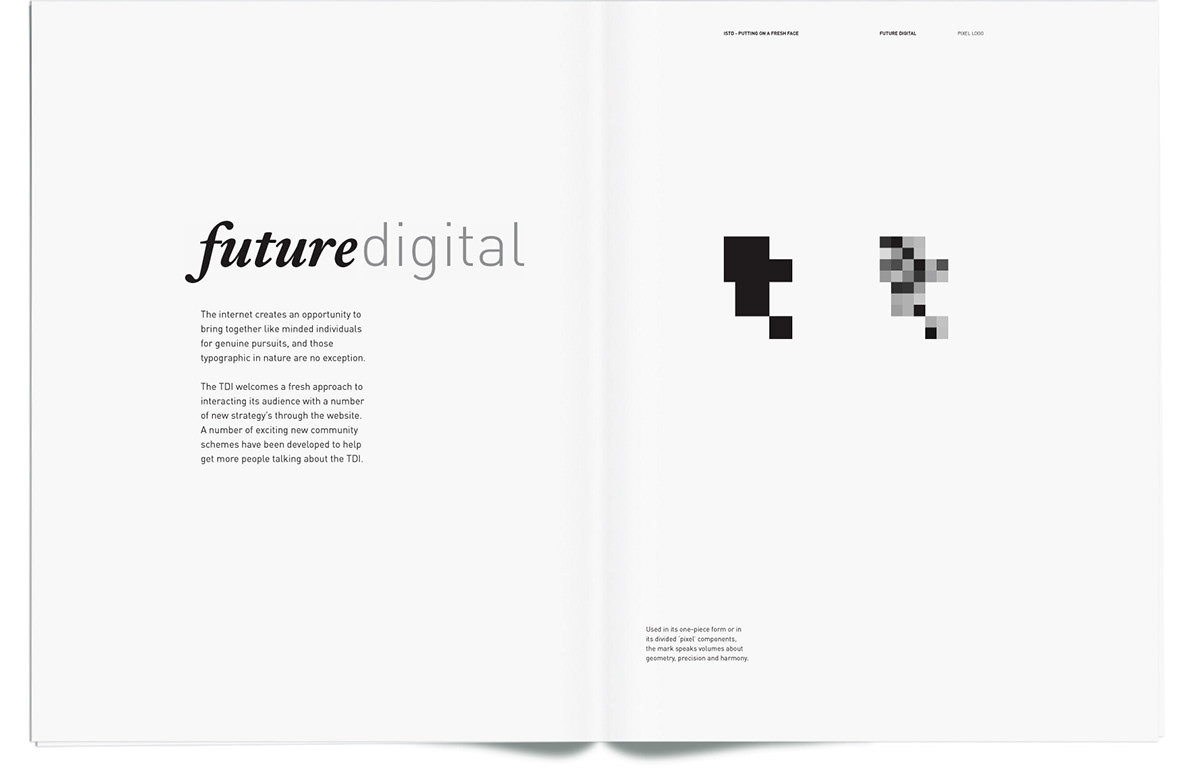
To bring the ISTD into the 21st Century, and in order to fulfill the requirements of the mainly typographic project, I constructed a branding style-guide and wrote a 2000 word manifesto, from the point of view of the directing board, served up in a 28-page newspaper. Going further than the requirements of the brief, and after careful consideration to vast research, I boldly changed the name of the ISTD, in an attempt to modernize them away from their perceived closed-door, elitist attitude. Thus, a new logotype and mark were developed densely packed with meaning and significance.
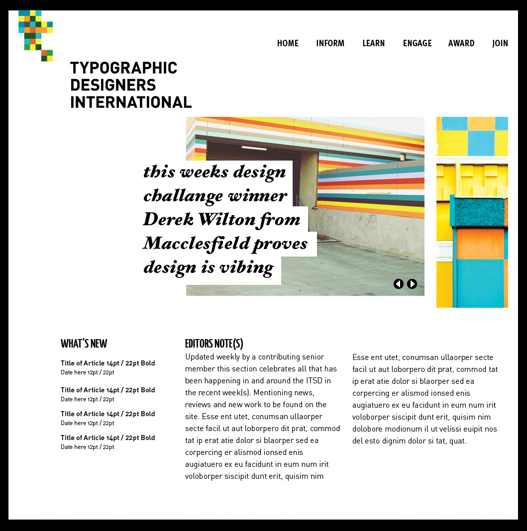
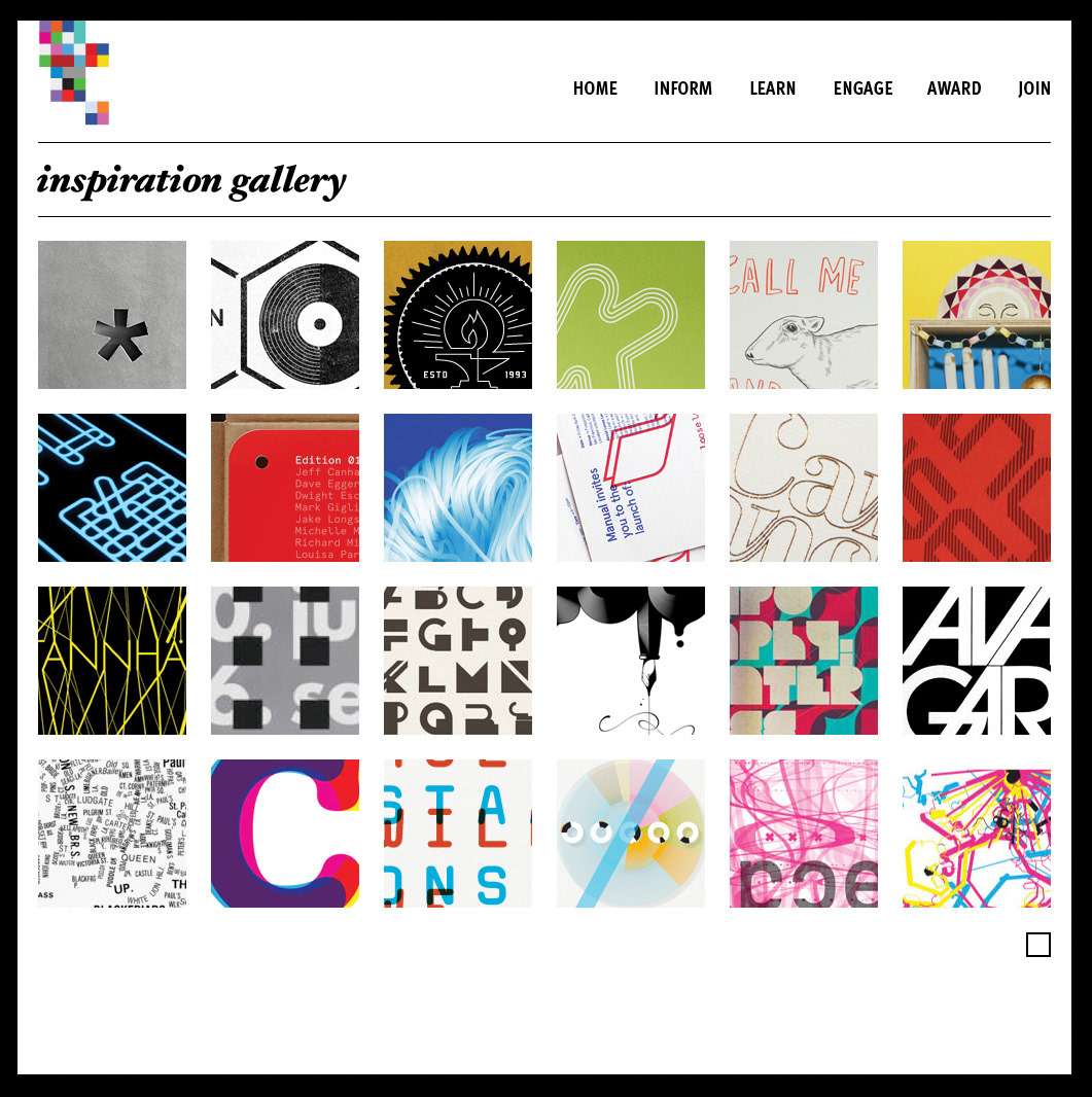
Exploring the development of the brand across numerous outcomes, and creating an online presence which actually achieved one of their original goals - to become the very source of typographic inspiration and a valuable resource to practitioners and educators alike.
In my opinion their current brand fails to represent the ISTD for what it is - an immense source of inspiration to students, educators and international practitioners alike.
To bring the ISTD into the 21st Century, and in order to fulfill the requirements of the mainly typographic project, I constructed a branding style-guide and wrote a 2000 word manifesto, from the point of view of the directing board, served up in a 28-page newspaper. Going further than the requirements of the brief, and after careful consideration to vast research, I boldly changed the name of the ISTD, in an attempt to modernize them away from their perceived closed-door, elitist attitude. Thus, a new logotype and mark were developed densely packed with meaning and significance.
Exploring the development of the brand across numerous outcomes, and creating an online presence which actually achieved one of their original goals - to become the very source of typographic inspiration and a valuable resource to practitioners and educators alike.